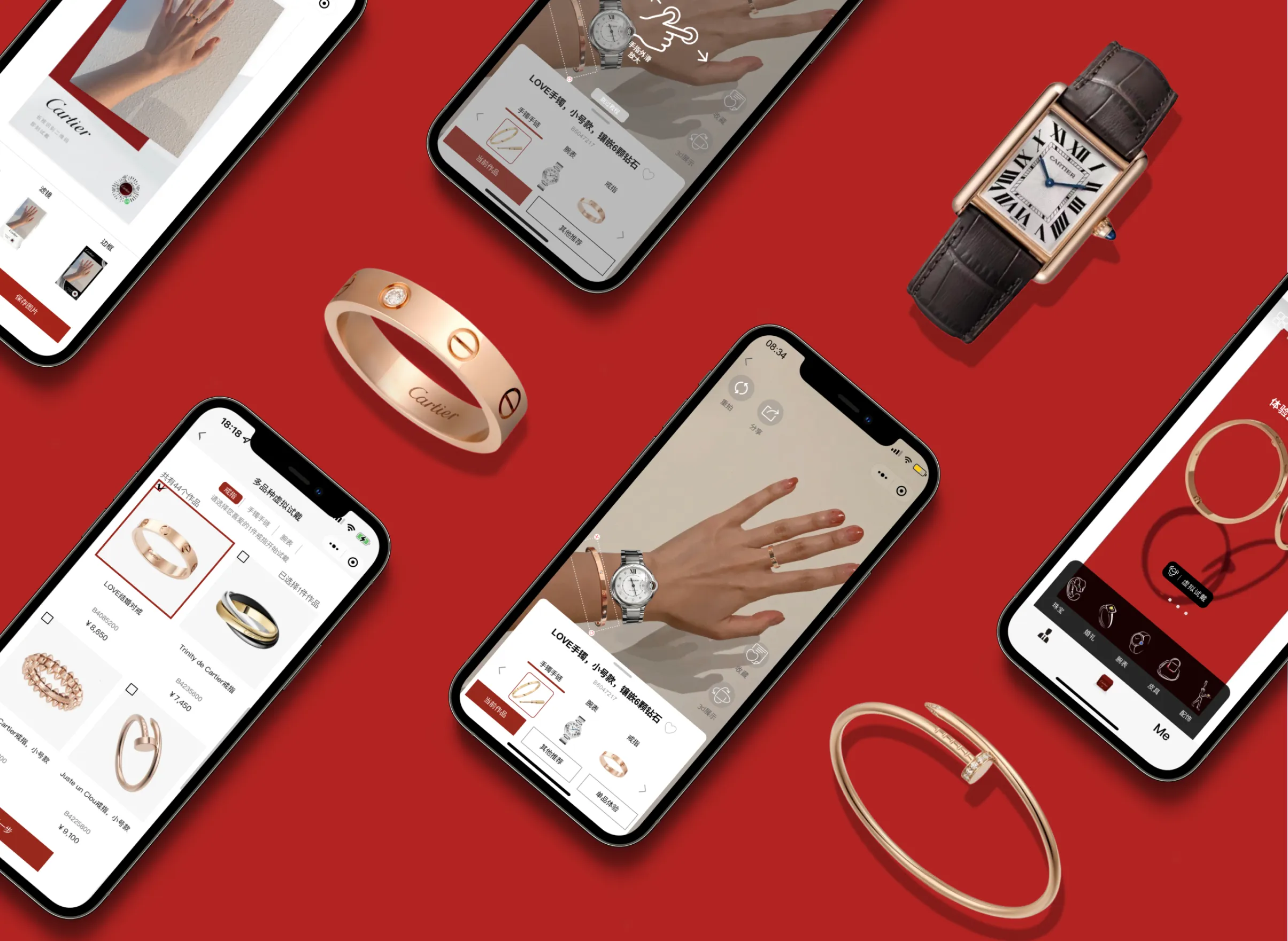

.png)
3 months, 2022
(contract)
5 product designers, 2 engineers, Cartier marketing team
Responsible for the redesign of AR try-on entrance; shipping 4 few features


.png)
Now we can even imagine trying on legendary jewelries on iPhone

Cartier first launched its virtual try-on feature in WeChat mini-program in the Chinese market, one of its prominent markets. However, even with its leading expertise in the AR technology and mass advertising, this amazing virtual try-on feature did not make the splash as Cartier has hoped. Specifically, analytics has indicated that:
Only less than 10% of the users of Cartier WeChat mini-app has used virtual try-on feature.
Among the customers who have discovered this feature, the retention rate is 47%, indicating only half of the users would return to try on again.
We first met with Cartier’s marketing team to understand their perspectives on why the virtual try-on feature’s performance fell short of the projection, what needs improvement and their overall expectation.
Users often inquired about how to find the entrance to Virtual Try-on.
100+ jewelries that support Virtual Try-on, but users are only able to find a few.
The filter to find all AR products is hidden from view, and it takes too many clicks.

It takes 6 steps to filter out all the products for AR Try-on, and the filter is hidden in the meatballs menu

“We have the new technology that restructures the photo-taking for try-on, but how can we integrate multi-category try-on into the current user flow?”
At present: try on one category of product at a time.
Users have to return all the way back to all product page, if they want to try-on from a different category.
Engineers have developed the technology of multi-category try-on but couldn’t figure out how to integrate it into the current user flow.
Based on the client requests, we conducted user research to gain more insights into the current user flow, user’s expectations and frustrations.


.png)
85% of the users were confused when asked to “try-on a product” when first entered the app

.png)
When asked to “choose a product for AR try-on”, around 40% of the users chose products that didn’t support AR try-on

.png)
15% of the users have mistakenly associated the 3D display icon

with AR try-on
45% of the users expected to see products from different categories for “other recommendation” button, as they wanted to see the entire look
Users indicate that they would love to try on and purchase matching products from the same series

“ Other Recommendations” only recommends products from the same category.
Users compliments the AR technology and express their wishes to share AR try-on photos on social media
They especially love trying on bracelets and watches because they can see the details clearly and can get immersed more in the luxury feelings

“I cannot stop trying on watches and bracelets because it feels so realistic”
Introduce a new virtual try-on entrance starting from homepage, to address user’s concern about the entrance being hidden too deep
Provide 2 flows of try-on for 2 user groups: New customers who are interested in exploring all collections and Cartier’s loyal customers who are more likely to be drawn to new and special collections.


We wanted to create a frictionless step-by-step process for users to directly enter from the main page and pick jewelries of different categories for AR try on. This process mimics selecting jewelries on a platter in store.


When it comes to special occasions, Cartier hope to promote their special collections. For users who are interested in these collections, they can click “try-on” button from Cartier’s poster home page to directly enter into the multi-category products photo taking page.
Support multi-categories product try-on by designing the process for photo-taking, adding and removing products from different categories
Allow switching between single and multiple categories of try-on to align with the mental models


.svg)
🌟 When users want to focus on one part, we help “filter out” the redundant information
🌟 When users want to see mix-and-match, we help to design “a walk in closet” to show the whole look
For users who are looking to purchase an item to match with another ( e.g., a bracelet to match a ring), the newly adapted multi-try-on feature for them to experience products from various categories all together.


We hope to combine our new design of multi-category try-on with Cartier’s current design of single-category try-on, to minimize the friction of the new flow.
Combine virtual try-on with Cartier’s existing feature 3D Display, to help users to see the details of the products more clearly.
Add History functions, in order for the users to keep track of the products they have tried on and to revisit them if desired. Users can also add products they have tried on to their Wishlist, and later purchase online or in store.
.svg)


🌟 These features appear at the right side as supplementary to the original try-on experience
🌟 Better integrate with existing functions and create more intuitive shopping experience
This mostly-favorable feature is now introduced into the Virtual Try-On Page. In this way, it realistically displays Cartier jewelry’s exquisite details, which serves as a “zoom-in” replenish to the “zoom-out” overall Virtual Try-On experience.


Similar to try-on in store where a sales assistant would put the jewelries users tried on in a platter, we would like to allow users to track their try-on record and wish list, makes it easier for users to establish their wishlist, and then better lead their final purchase decision.
As we presented our designs to stakeholders and users, we received generally, really positive comments. But there were also several feedbacks that made us think more about the constraints regarding migrating our designs into the current Cartier design flows. Therefore, we made a few interactions to address these feedbacks.
When conducting user testing, we noticed that users were trying to click into each product to see details during try-on selection. We found out that this was because the virtual try-on selection page looks too similar to Cartier’s product display page. So we have removed all the irrelevant icons and added a selected state with outlines to check boxes to differentiate.


History and 3D Display in our previous design iteration were externally linked to the original “My Favorite” and “3D Display” pages, which difficult because it jumps outside of “AR Try-On” page, as explained to us by developers. So we designed floating action buttons which opens up modals for these features to exist within the try-on page.
.webp)
